


Race and Police Shootings in the Book 'Deadly Force'
Some early thoughts on a big new dataset

A trio of academics have gotten tons of new data on police shootings—including nonfatal ones—by filing requests with cities across the country. They’ve published a book about it and, to their immense credit, made their data and code public.
I’ll have a normal review of Deadly Force soon. But here, digging into the new dataset, I’ll take a skeptical look at some of their evidence of unjustifiable racial disparities. These points are too far in the weeds for a general audience.
Essentially, in analyses presented in Chapters 5 and 6, the authors find that African-Americans are disproportionately shot by the police even after accounting for crime rates in various ways. My overall concern with this approach is that it’s hard to tell what kind of crime rates one should account for: Crimes, and even violent crimes specifically, vary markedly in both their level of violence and in their racial offending disparities.
My more specific concern is that, in some of the book’s most striking charts, the authors severely underestimate the percentage of criminal offenders who are black by including large numbers of individuals with unknown races in the denominator.
***
First, a bit of background on the “benchmarking” approach in studies of bias in police shootings.
Here’s a chart I made for a report a few years back. It shows how fatal police shootings compare, demographically, with various potential benchmark populations, ranging from America as a whole to cop killers:
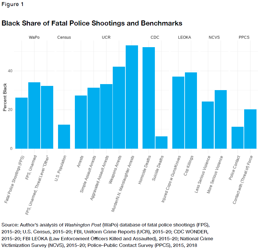
Obviously, it makes a huge difference which one you pick, and in truth, none of them is a perfect stand-in for people who’d be killed by the police in a world without racial bias. Many people shot by police are at the extreme high end of the violence spectrum—attacking armed cops—but there are also those having mental-health crises, not to mention cases where cops misjudge threats, overreact, act abusively, or catch innocent people with stray bullets (which are all bad but are different from racial bias). Situations that lead to police shootings are a complicated blend of other problems, and each problem has a somewhat different underlying racial mix.
And oddly, in terms of crime-rate comparisons, the more selective you think police are in whom they shoot, the higher the black share you might expect: The most extreme benchmarks, such as murder offenders and cop-killers, tend to have quite high black shares. If you treat either of those as the definitive benchmark (which you should not), the black share of fatal police shootings is actually “too low.”
***
At any rate, based on the above background knowledge, I found the following chart from Deadly Force’s Chapter 6 interesting.1 It suggests that, as the share of criminal offenders who are black in a city rises, the black share of people shot by the cops—including nonfatally, a key advantage their data have over other sources—goes up much faster. If a quarter of a city’s criminal offenders are black, close to half of the folks shot by cops will be, on average. When the authors restrict to violent offenders, the gap is smaller but still substantial.

My first instinct was to turn to the Supplementary Homicide Report and look at the percentage of homicide offenders who are black instead of these broader offending groups.2 Again, there is no perfect comparison group here, but for precisely that reason, it’s helpful to look at disparities across the full spectrum of crime, not just for crime or even violent crime in general.
But as I set about doing that, the fact that no city had more than about 50% black offenders in the above chart started to stand out to me. Digging deeper, I noticed something in their code: They were straining out police-shooting subjects, but not criminal offenders, with unknown races before calculating the percentages. Not all offenders are caught or even seen, so unknown races are extremely common in the dataset they’re using for offender demographics. When you include them in the denominator, the whole chart gets smushed to the left, while of course the diagonal Y=X benchmark line remains fixed where it is.
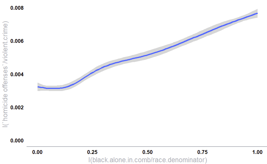
When I simply removed the unknown-race offenders before calculating the percentages, and kept the rest of the code the same, I got a rather different picture:
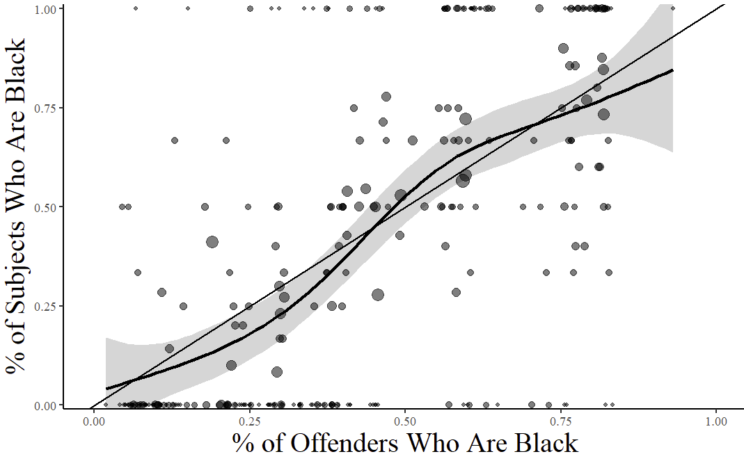
I emailed the authors about this. They did admit there’s a coding error, but to my surprise, they said their mistake was in too aggressively filtering the police-shooting side of the data, not in their treatment of the offender data.3 They had removed individual police shootings with unknown races before calculating the percentages, when what they had meant to do was leave out the percentages themselves when they came from departments that didn’t provide any race data at all. Otherwise, they intended to leave the unknown races in when calculating the racial proportions. Their updated charts, which they said they plan to publish in an erratum, barely change.
(Note that departments that didn’t provide race data don’t appear either way; the difference is only in cases where the department did report race data on people they shot, but happened to be missing it for a specific person.)
By my math, around 40% of the offender races are “unknown” or NA in the data fed into the updated chart, versus less than 10% for the remaining police shootings. It’s not too surprising that departments know the people they shot better than they know the offenders in reported crimes, including unsolved ones. This strikes me as a problem that should be addressed, by either removing or imputing the missing races, when comparing proportions across the two.
***
One last comment. In Chapter 5, analyzing census tracts from a small collection of cities with data that granular,4 the authors find an interaction between violent crime and black population: As violent crime goes up, police shootings increase more quickly in more heavily black places, even after controlling for some other things like poverty. Their statistical model is not the one I’d have made, for whatever that’s worth, but I don’t dispute that the pattern exists.
Yet this, too, is vulnerable to the criticism that “violent crime” does not mean the same thing across racial lines. What’s true at the individual level also appears true for the census tracts in their data. As tracts’ black population share increases, so does the proportion of their violent crimes that are homicides.5
With a bigger geography like states, you could control for homicide rates instead of or in addition to violent crime. But at the level of census tracts, the overwhelming majority have zero homicides in a year; on an observation-by-observation basis, the number of homicides is more of a random draw than a good measure of the overall risk of extreme violence in the place. I’m not sure it’s possible to tease the effect of race apart from other factors at the tract-by-year level of analysis.
***
This book and the accompanying data are a great resource, and I hope they inspire a lively back-and-forth about the correct ways to analyze these numbers.
This is my recreation from their public code.
For those interested, here’s that chart:

Race-unknown offenders, manslaughter by negligence, and felons killed by police or private citizens removed. Offenders are counted across all 11 possible fields used in cases with multiple offenders. Known-race offenders are used to weight the smoother.
X axis calculated based on: Kaplan, Jacob, 2025, "Summary Reporting System (SRS) - Supplementary Homicide Reports (SHR)", https://doi.org/10.7910/DVN/YB76AT, Harvard Dataverse, V1
Per the erratum they provided and plan to publish soon, “These lines of code were designed to omit from the figure all years where cities provided no data on suspect race, but they inadvertently also omit observations where suspect race is missing for some observations in from a city-year that otherwise provided race data.”
They’re using the Crime Open Database (CODE), which seems pretty neat and goes with the crimedata R package.
Smoother weighted by violent crimes so that places with bigger denominators have more sway in calculating the overall proportion; result is similar but without the flatness at the left when I weight by tract population.